


Fonts for Luxury Lawyer: Choosing the Perfect Font for Legal Excellence
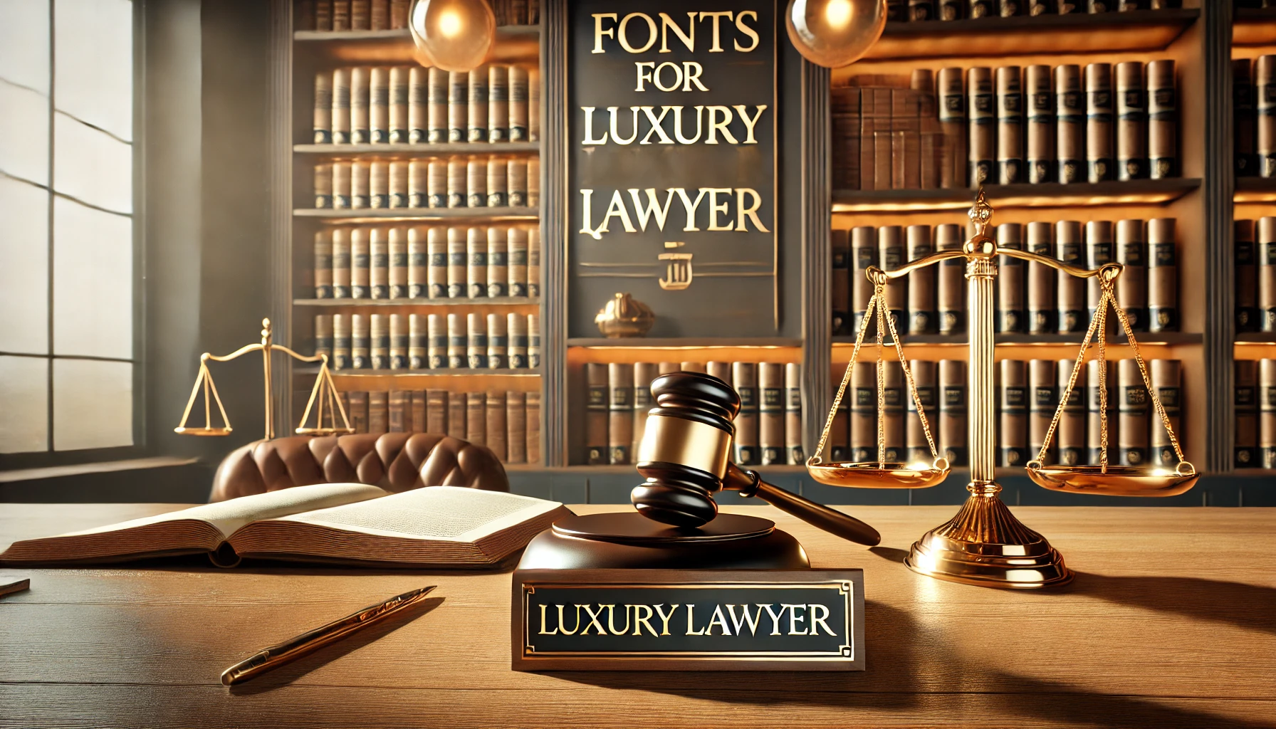
Typography plays a crucial role in shaping a law firm’s brand identity. The choice of fonts conveys professionalism, trustworthiness, and sophistication, which are essential qualities for attracting and retaining clients. Selecting appropriate fonts for luxury lawyers ensures that all communications reflect the firm’s esteemed image.
Luxury fonts are characterized by their elegance, clarity, and timeless appeal. They often feature refined lines, balanced proportions, and a harmonious appearance, contributing to a sense of exclusivity and prestige. In the legal sector, such fonts enhance the firm’s authoritative presence.
Selecting the Right Fonts for a Luxury Law Firm
Choosing the appropriate font is crucial for a luxury law firm, as it reflects the firm’s professionalism and brand identity. Fonts like Garamond, Baskerville, and Bodoni are excellent choices due to their elegance and readability. These typefaces convey a sense of tradition and trustworthiness, essential qualities for legal practices.
Incorporating these fonts consistently across all platforms—websites, legal documents, and marketing materials—ensures a cohesive and sophisticated brand image. This uniformity not only enhances visual appeal but also reinforces the firm’s commitment to excellence and attention to detail.
Key Considerations for Choosing Fonts
Readability and Accessibility
Ensuring that fonts are easily readable across various mediums is paramount. Clients and colleagues must be able to read legal documents and digital content without strain. Choosing fonts with clear letterforms and adequate spacing enhances accessibility, reflecting the firm’s commitment to effective communication.
Serif vs. Sans-Serif Fonts
Serif fonts, with their decorative strokes, exude tradition and authority, making them suitable for formal documents and headings. Examples include Garamond and Baskerville. Sans-serif fonts, lacking these embellishments, offer a modern and clean appearance, ideal for digital platforms. Fonts like Helvetica and Futura fall into this category.
Font Pairings
Combining fonts can create visual hierarchy and interest. A common practice is pairing a serif font for headings with a sans-serif font for body text, balancing classic elegance with contemporary clarity. For instance, using Baskerville for titles and Helvetica for content can achieve this effect.
Size and Spacing
Appropriate font size and spacing are vital for readability. Standard practice involves using a 12-point font size for body text, with sufficient line spacing to prevent crowding. Attention to kerning (space between characters) and leading (space between lines) ensures a clean and professional look.
Recommended Fonts for Luxury Law Firms
Serif Fonts
- Garamond: Renowned for its timeless elegance, Garamond offers readability and a classic aesthetic, making it suitable for both print and digital mediums.
- Baskerville: With its sophisticated and authoritative design, Baskerville is ideal for headings and formal documents, enhancing the firm’s professional image.
- Bodoni: Characterized by high contrast and stylish serifs, Bodoni adds a touch of modernity while maintaining a luxurious feel, perfect for logos and titles.
Sans-Serif Fonts
- Helvetica: A clean and professional font, Helvetica is versatile and widely used in corporate branding, suitable for various applications from websites to correspondence.
- Futura: Known for its modern and geometric design, Futura conveys a contemporary look, appealing to forward-thinking clients.
- Optima: Blending serif and sans-serif qualities, Optima offers a unique and elegant appearance, suitable for firms seeking a distinctive yet professional image.
Application of Fonts Across Brand Assets
Website Design
In digital spaces, sans-serif fonts like Helvetica and Futura are preferred for their clarity on screens. Ensuring fonts are web-safe guarantees consistent display across different browsers and devices. Responsive typography adapts to various screen sizes, maintaining readability on both desktops and mobile devices.
Legal Documents
For formal documents, serif fonts such as Garamond or Baskerville are recommended due to their traditional and authoritative appearance. Consistency in font choice across all legal paperwork reinforces the firm’s brand identity and ensures a cohesive look.
Marketing Materials
Marketing collateral, including brochures and business cards, benefit from a combination of serif and sans-serif fonts. This pairing creates a visual hierarchy, guiding the reader’s attention effectively. For example, using Bodoni for headings and Helvetica for body text can make materials both appealing and readable.
Best Practices for Font Implementation
Consistency Across Platforms
Maintaining uniformity in font usage across all platforms—print, digital, and environmental signage—ensures a cohesive brand image. A style guide documenting font choices, sizes, and applications serves as a reference for all branding materials, promoting consistency.
Licensing and Legal Considerations
It’s essential to secure proper licensing for all fonts used in the firm’s materials to avoid legal complications. Many professional fonts require a license for commercial use, and adhering to these agreements reflects the firm’s respect for intellectual property laws.
Testing and Feedback
Before finalizing font selections, testing them across various mediums is advisable. Gathering feedback from staff and clients can provide insights into readability and aesthetic appeal, ensuring the chosen fonts resonate with the intended audience.
Conclusion
Recap of the Importance of Thoughtful Font Selection
Selecting appropriate fonts is more than an aesthetic choice; it’s a strategic decision that influences client perceptions and reinforces the firm’s brand identity. Thoughtful typography enhances professionalism and trustworthiness, key attributes for a luxury law firm.
Encouragement to Invest in Professional Typography
Investing in high-quality fonts and consistent typographic practices yields long-term benefits. A well-crafted typographic identity distinguishes the firm in a competitive market, leaving a lasting impression on clients and stakeholders.
By meticulously selecting and implementing fonts that align with the firm’s brand values, a luxury law firm can project an image of excellence and sophistication, fostering confidence and trust among its clientele.
FAQs
What are the best fonts for a luxury law firm’s branding?
Elegant serif fonts like Garamond, Baskerville, and Bodoni convey professionalism and sophistication, ideal for luxury law firms.
Why is font choice important for law firm websites?
Appropriate fonts enhance readability and establish trust, impacting client perception and the firm’s authoritative image.
Should law firms use serif or sans-serif fonts in legal documents?
Serif fonts are traditionally preferred for printed legal documents due to their readability and classic appearance.
Can font selection affect a law firm’s brand identity?
Yes, consistent and professional font choices reinforce a firm’s brand identity, conveying reliability and expertise.
Are there specific fonts recommended for digital platforms?
Sans-serif fonts like Helvetica and Arial are often used for digital platforms due to their clarity on screens.